
Client / New Oriental Group (koolearn.com)
Time / Early 2019
My Role / Illustration and Design
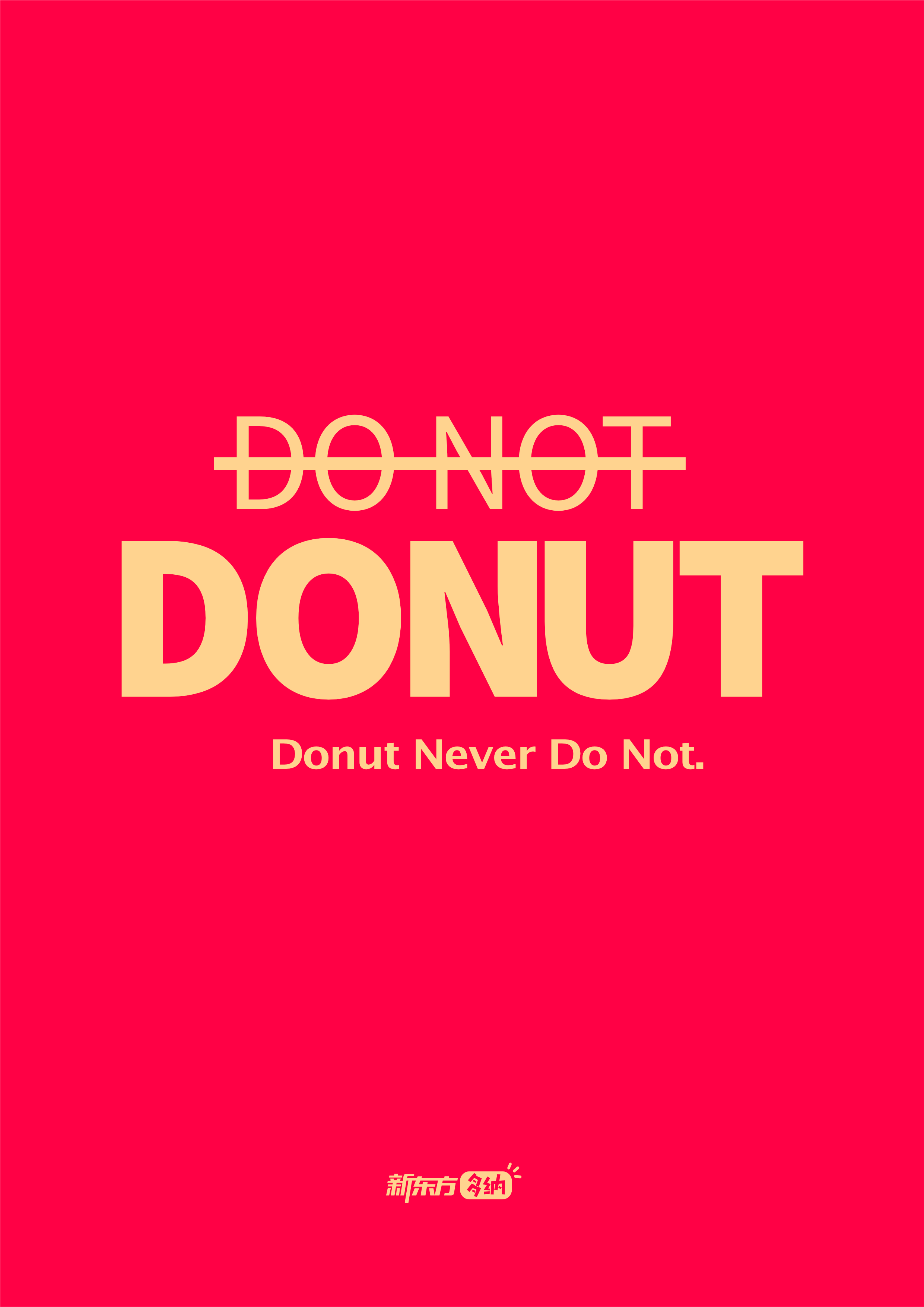
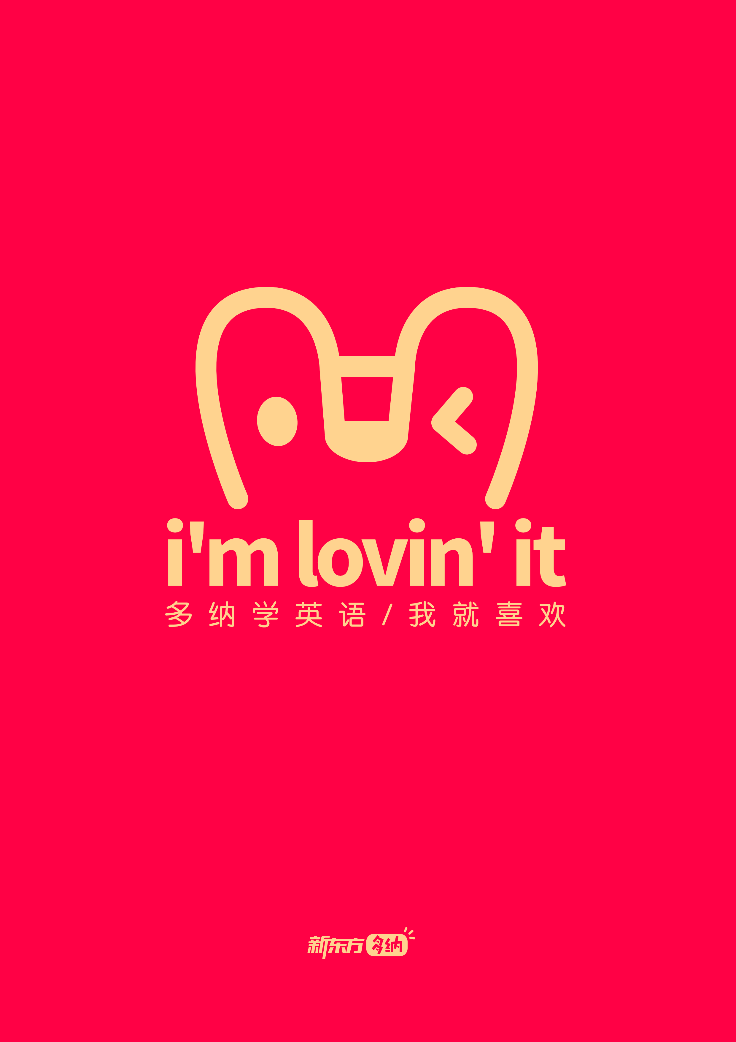
The New Oriental Donut English is a New Oriental online children's English brand designed for children aged 4-12. Children's English course, with professional European and American foreign teachers, rich animation scenes, Cambridge Guess What textbooks. The interactive teaching session will multiply the children's enthusiasm for learning English and let the children talk to the world.
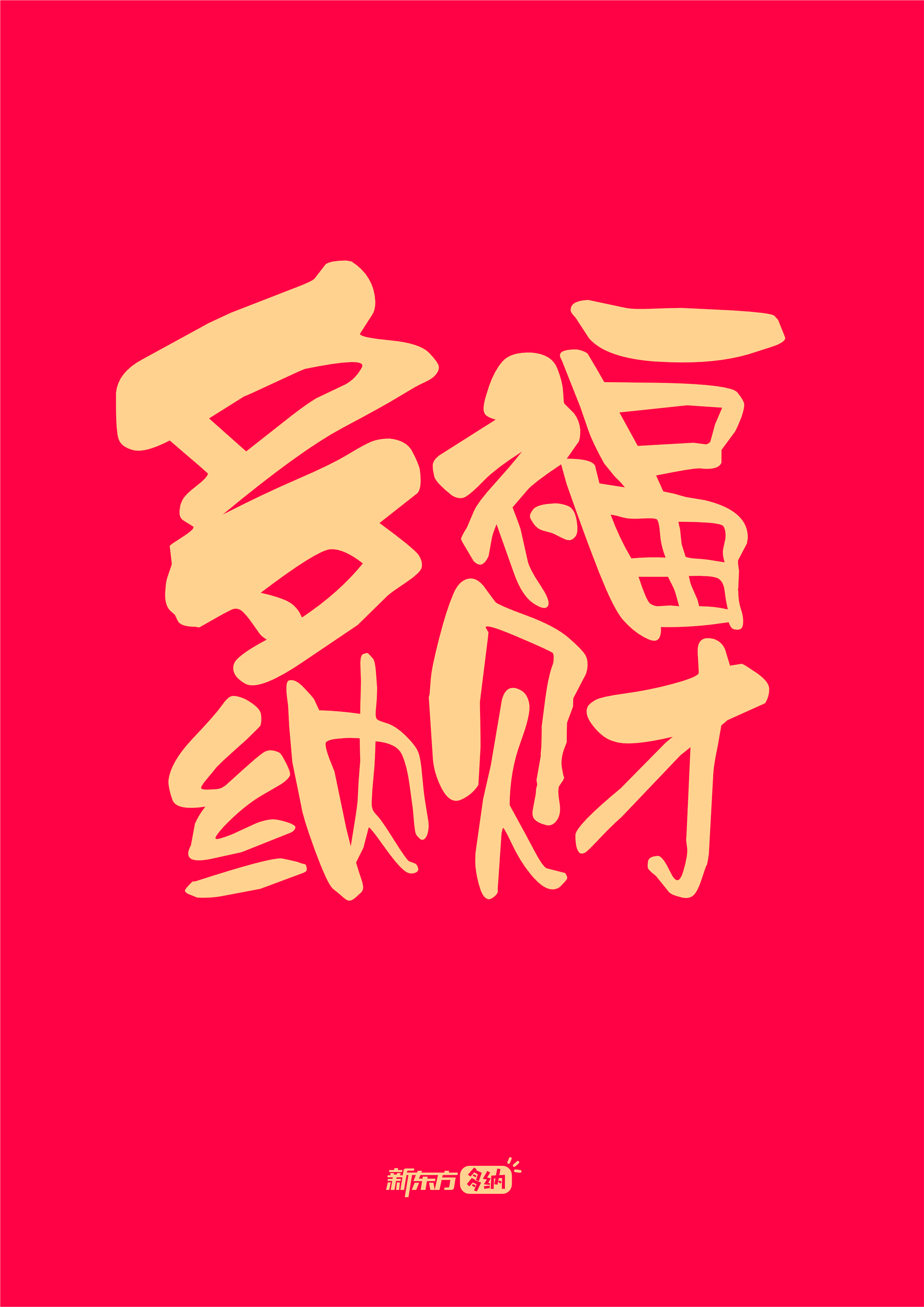
This is a series of typography posters about Chinese spring festival and brand. In the past, our branding communication design was for the public with less aesthetic expression and more familiar illustrations. This project is a try for a new expression, typography combined branding information, the spring festival information. It is a direct, clear, and simple way to do communication
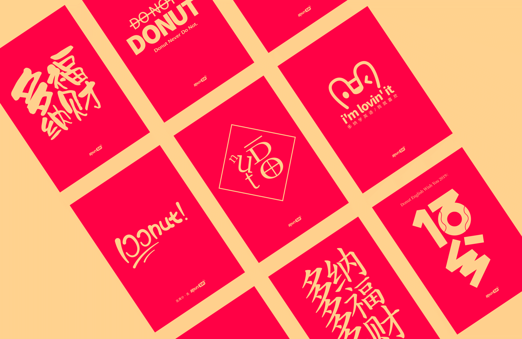
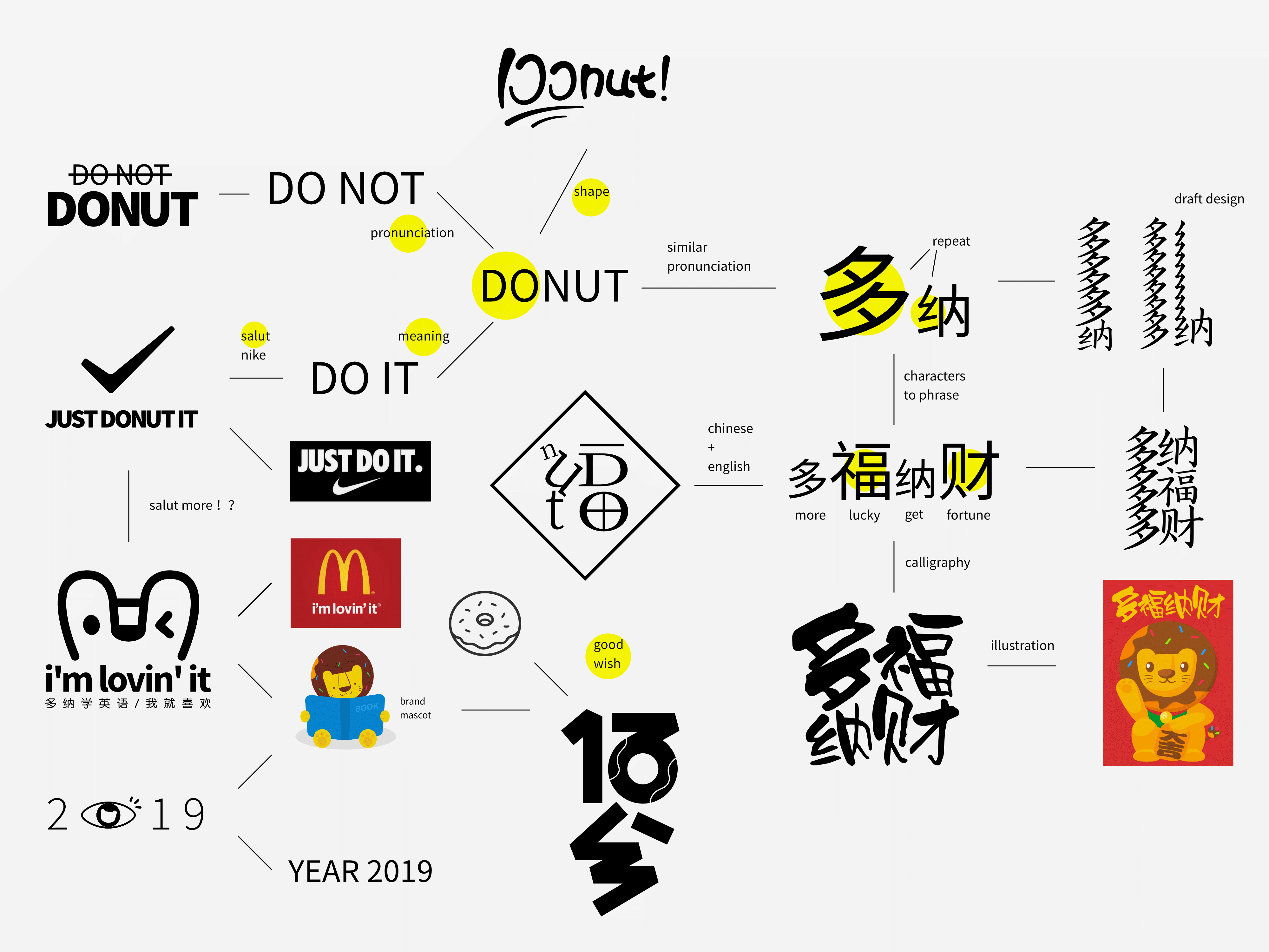
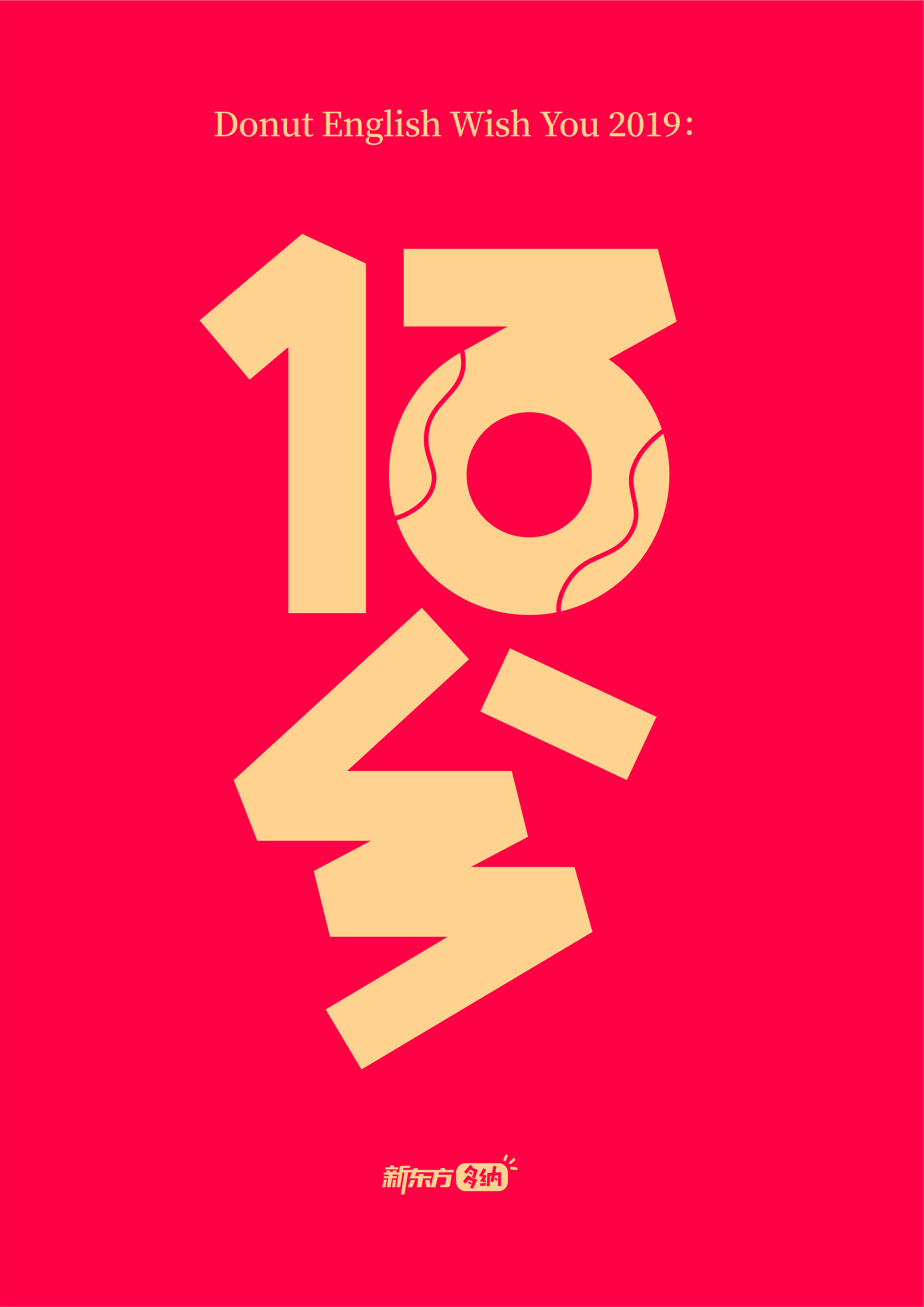
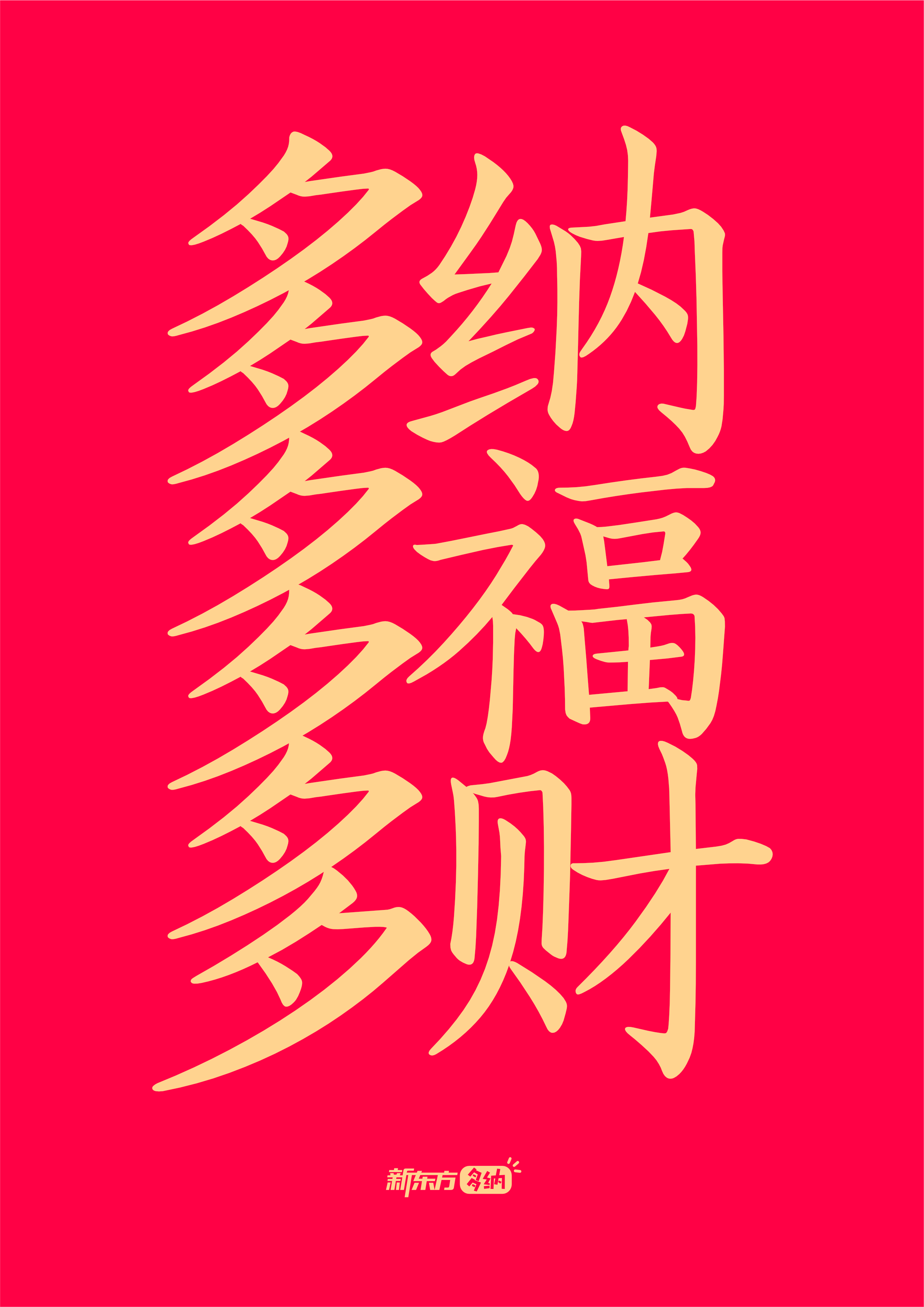
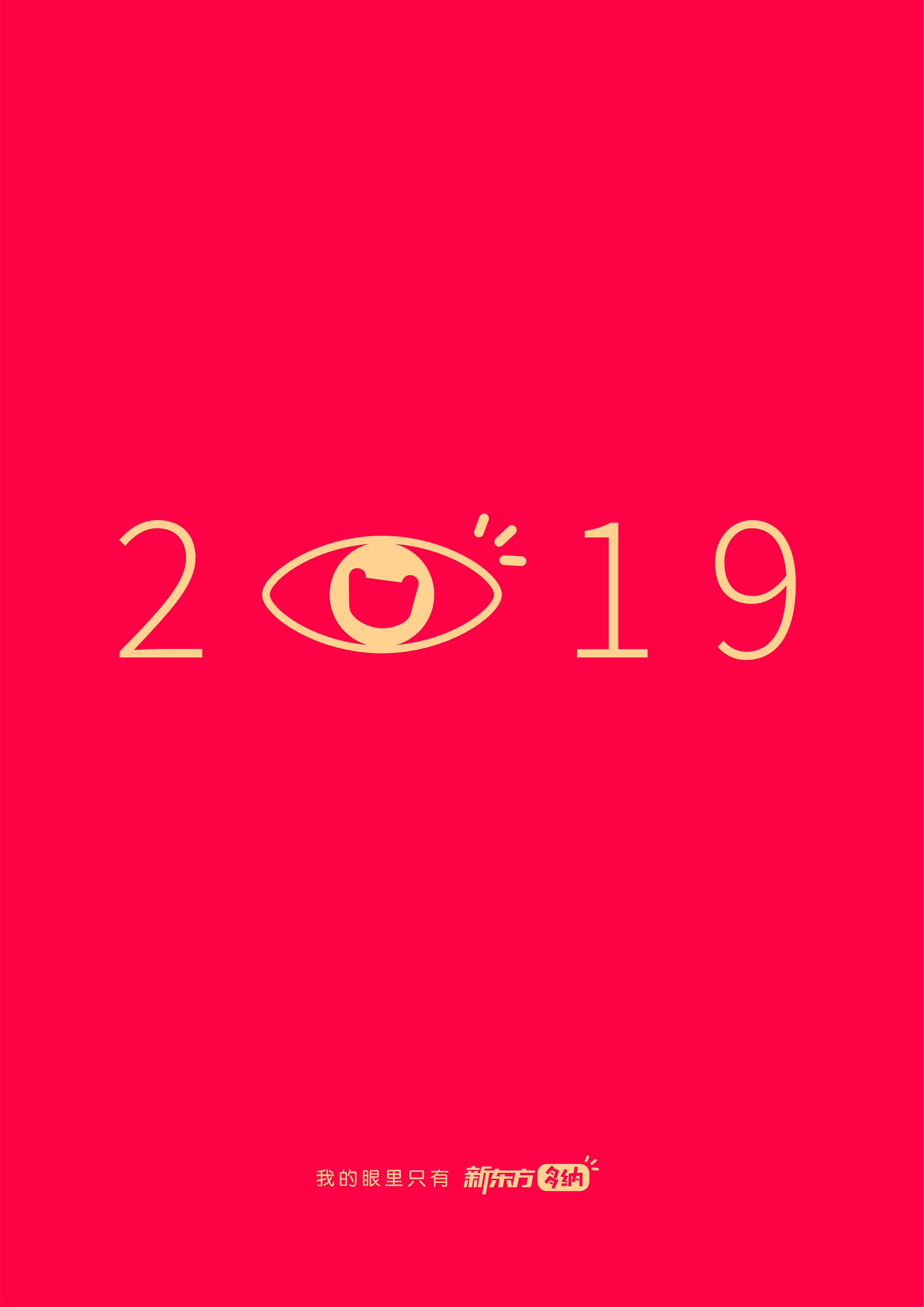
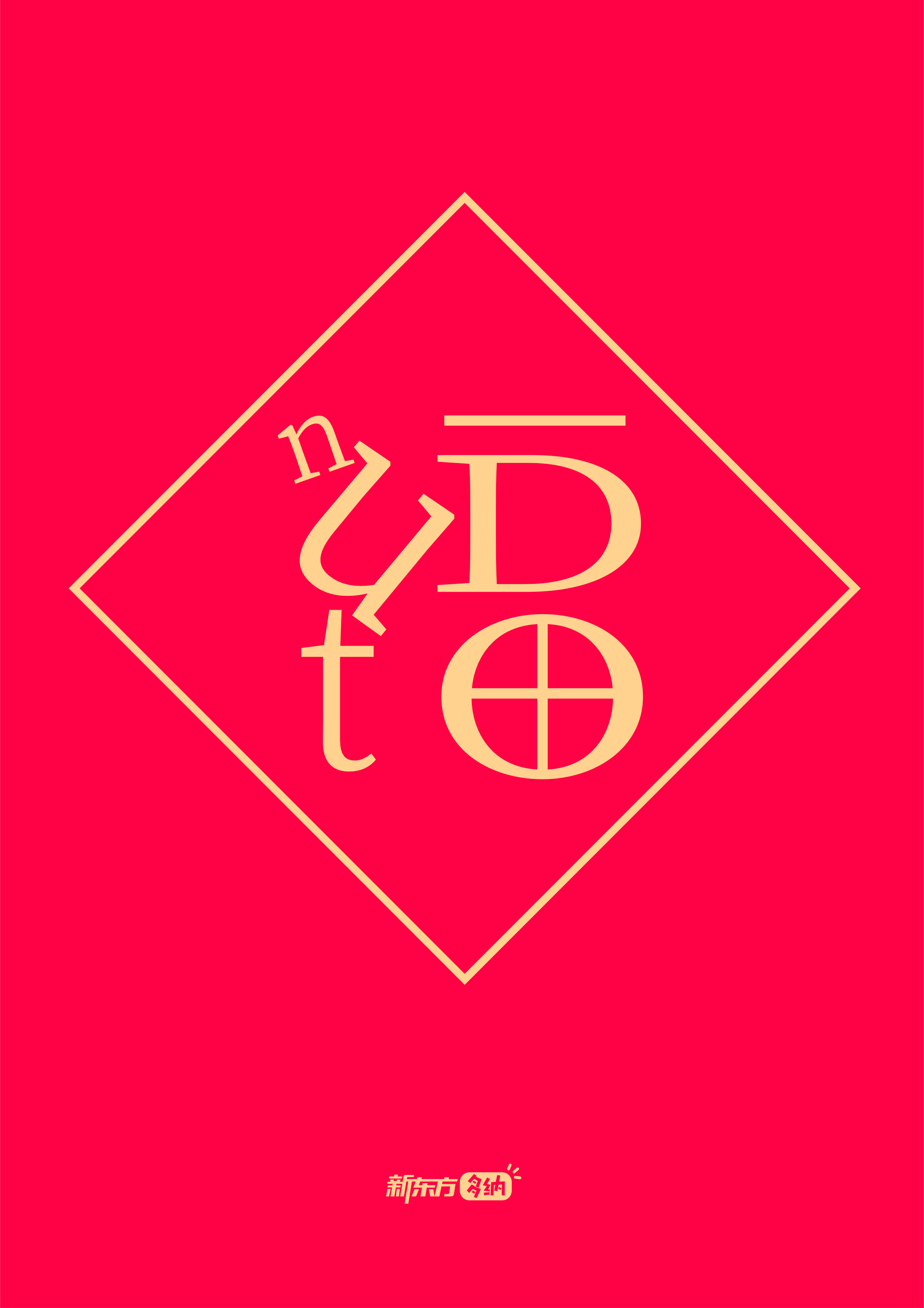
Design should be developable and continuable. This series of typography has three basic principles. They are the special structure of character or words, a similar pronunciation, and branding or festival saluting.
The idea mapping starts from the repeat structure of the Chinese character "Duo" (the English meaning is "More") Then I do the mind storming base on the three principles. Finally, I found those idea points become line and plane. I also believe that in this way we can develop more.
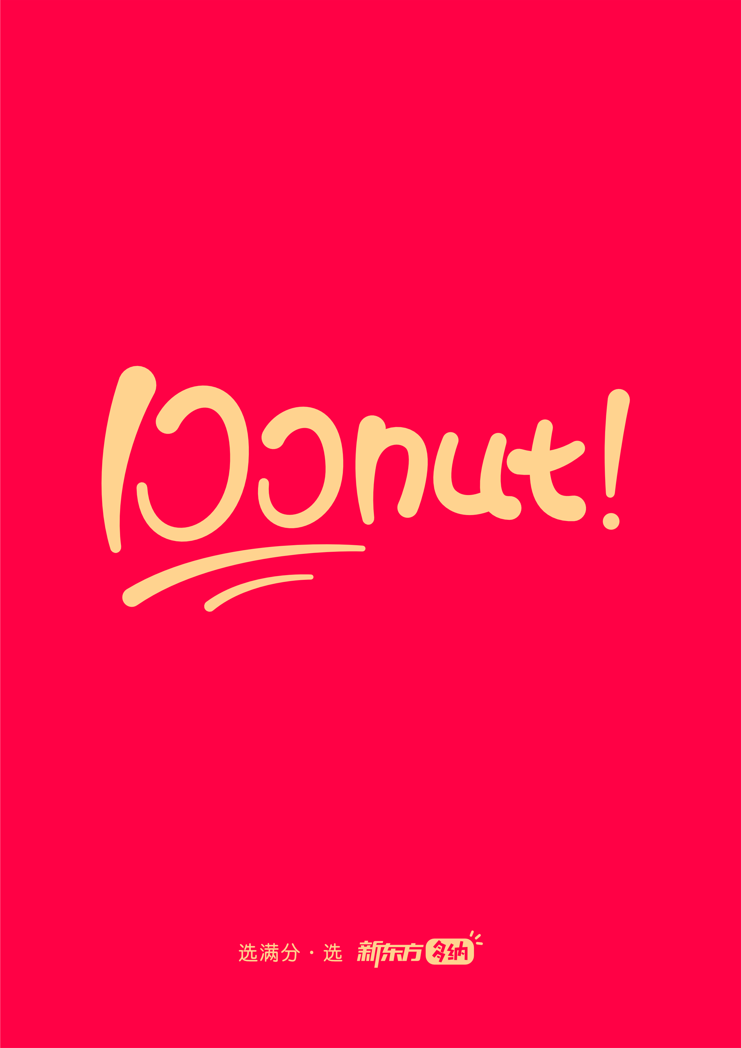

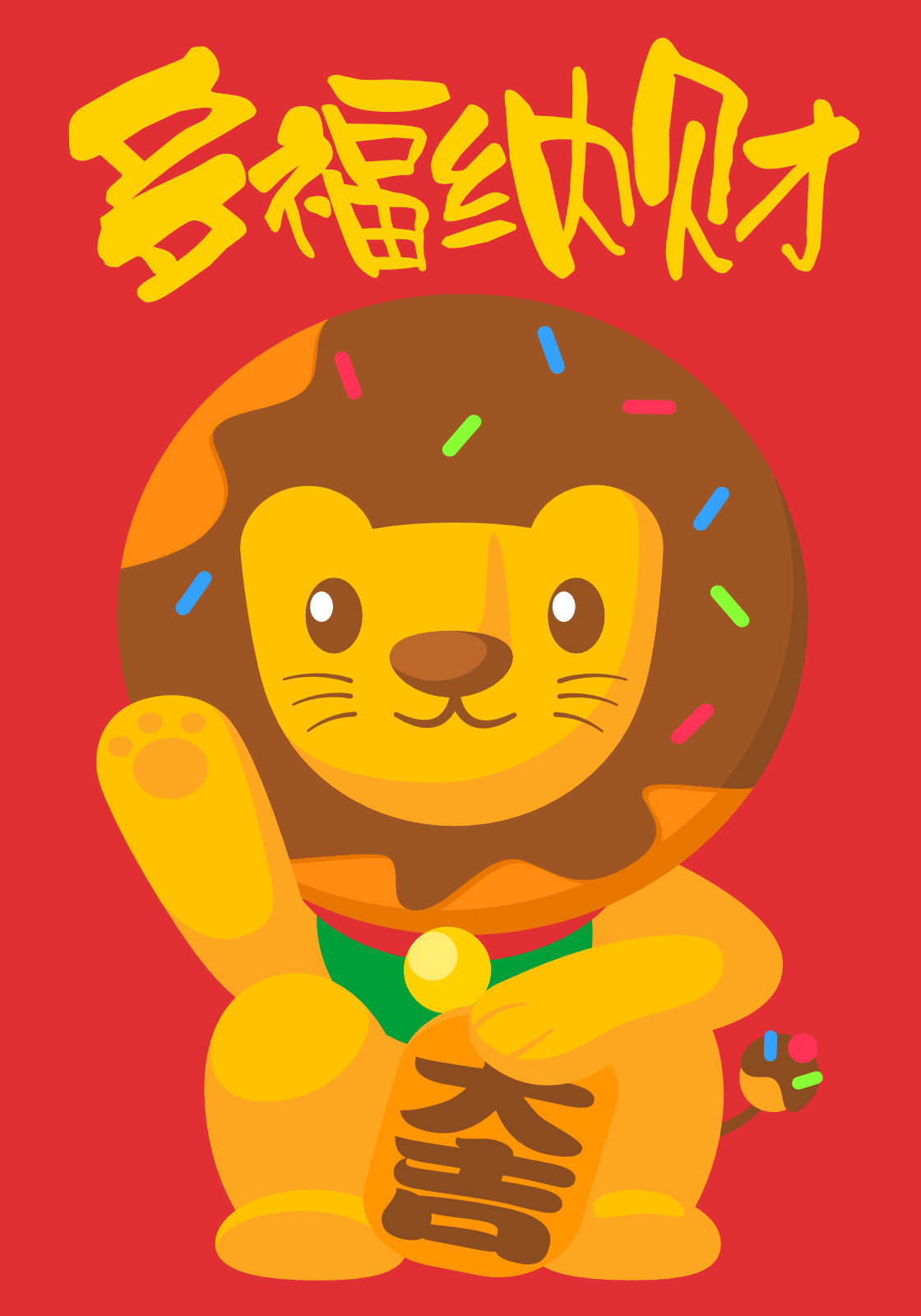
GUESS YOU LIKE
