Client / Lizi Studio
Time / Late 2016 - Mid 2017
My Role / Branding Design
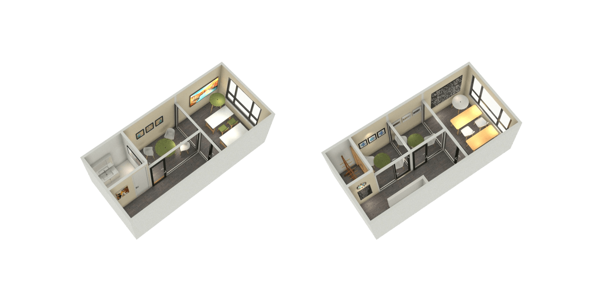
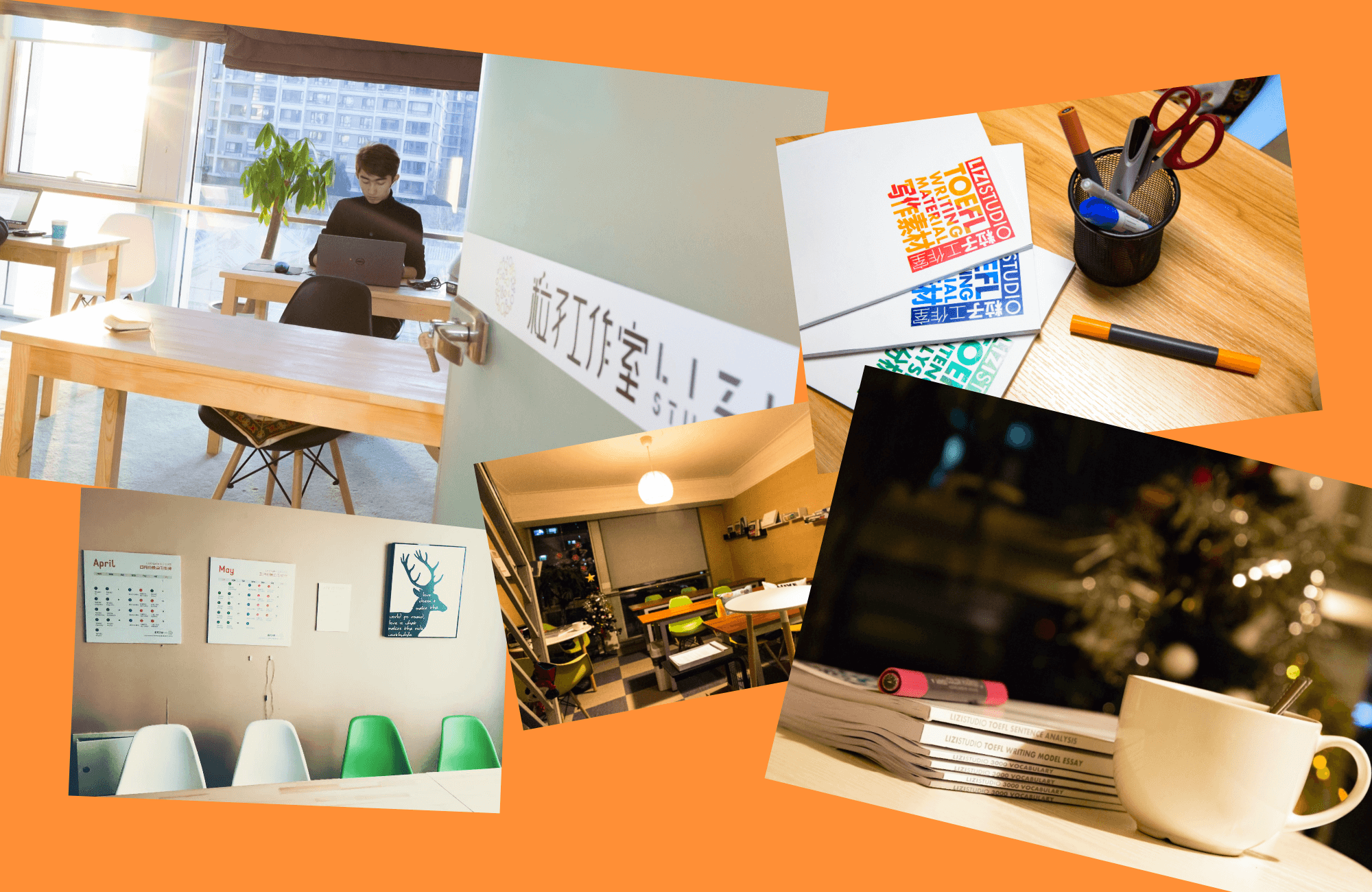
Lizi is an Education Institution that teaches English and does the consulting to help students who want to study aboard. This Project is a branding design based on a logo (My Clent gave me the logo that she designed at first and want me to build the brand). I did the commercial research at first, then I did the works of Visual Identity Design, Interior Design, Marketing Communication Works Design. Lizi's commercial-scale became 300% during the period.
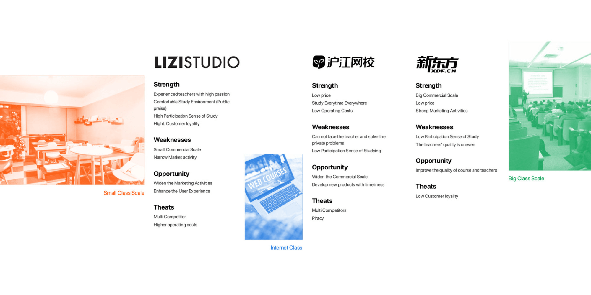
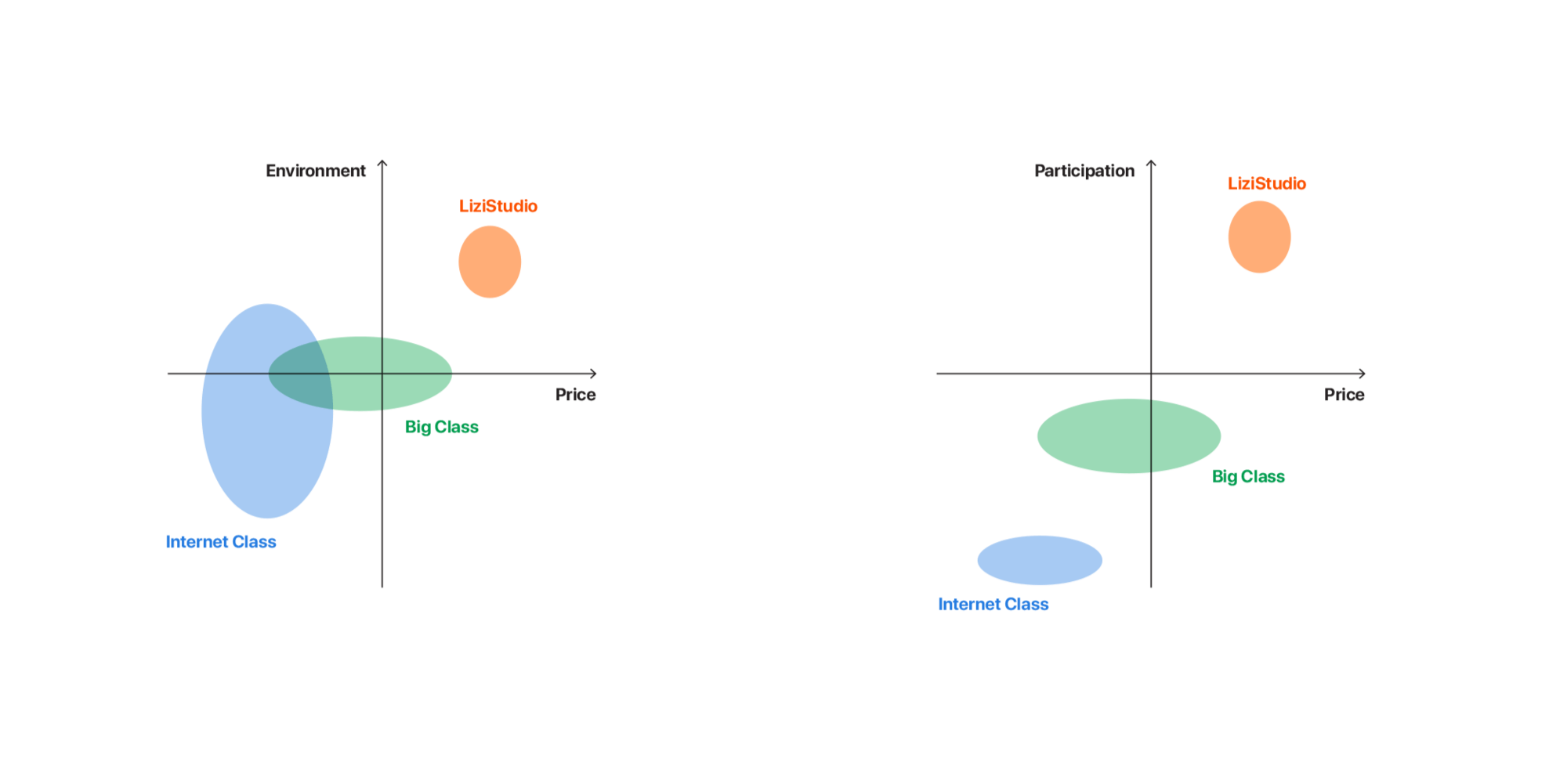
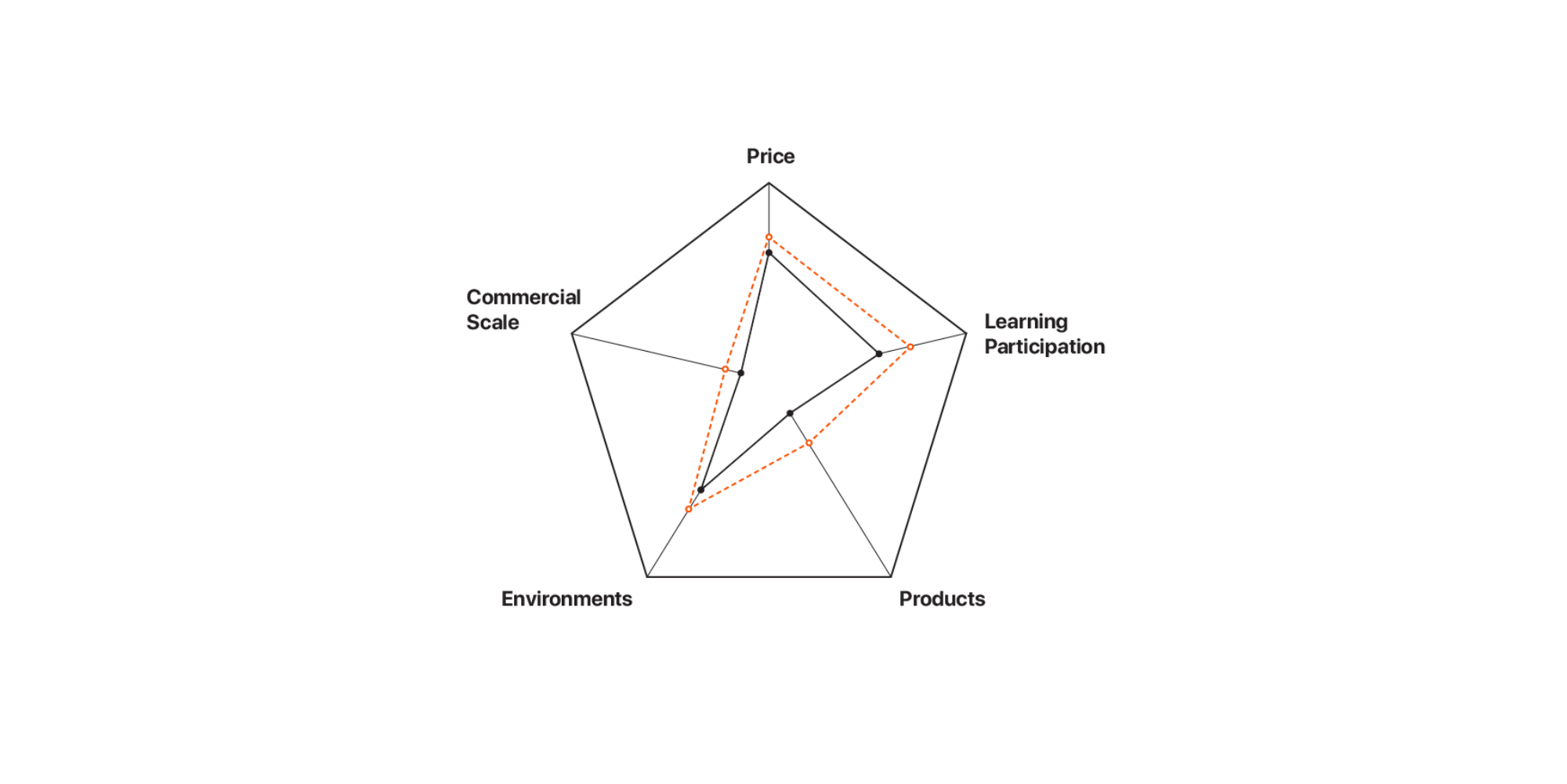
- The quality of teaching, the comfortable environment, and the high learning participation are the core-competitiveness.
- Although reputation is good, the revenue and benefits are weak.
- The dream is one of the keywords of LIZI.
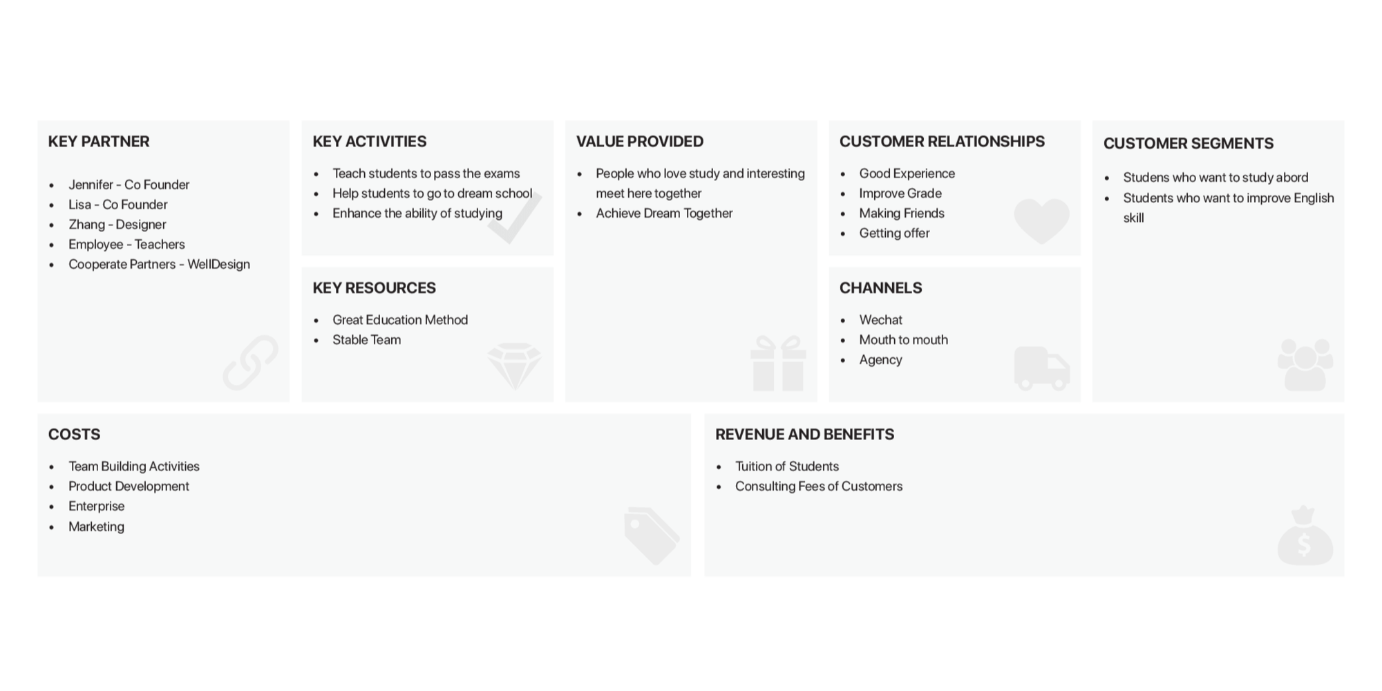
- The commercial-scale of Lizi is too small to develop stably.
- The public praise comes from its great study environment and study participation, which should be kept and enhanced.
- Compared with Big Scale Class and Internet Class, LIZISTUDIO’s marketing activities are worst.
- Lizi's Small Scale Class has the best cost performance, which has high strong competitive strength.
- Lizi's products line is too narrow. LIZI should develop more products to fulfill more users’ needs.
- Improve the brand image to enhance the user experience.
- Build WeChat Offical Accounts to widen marketing activities.
- Widen the commercial-scale to echo public praise.
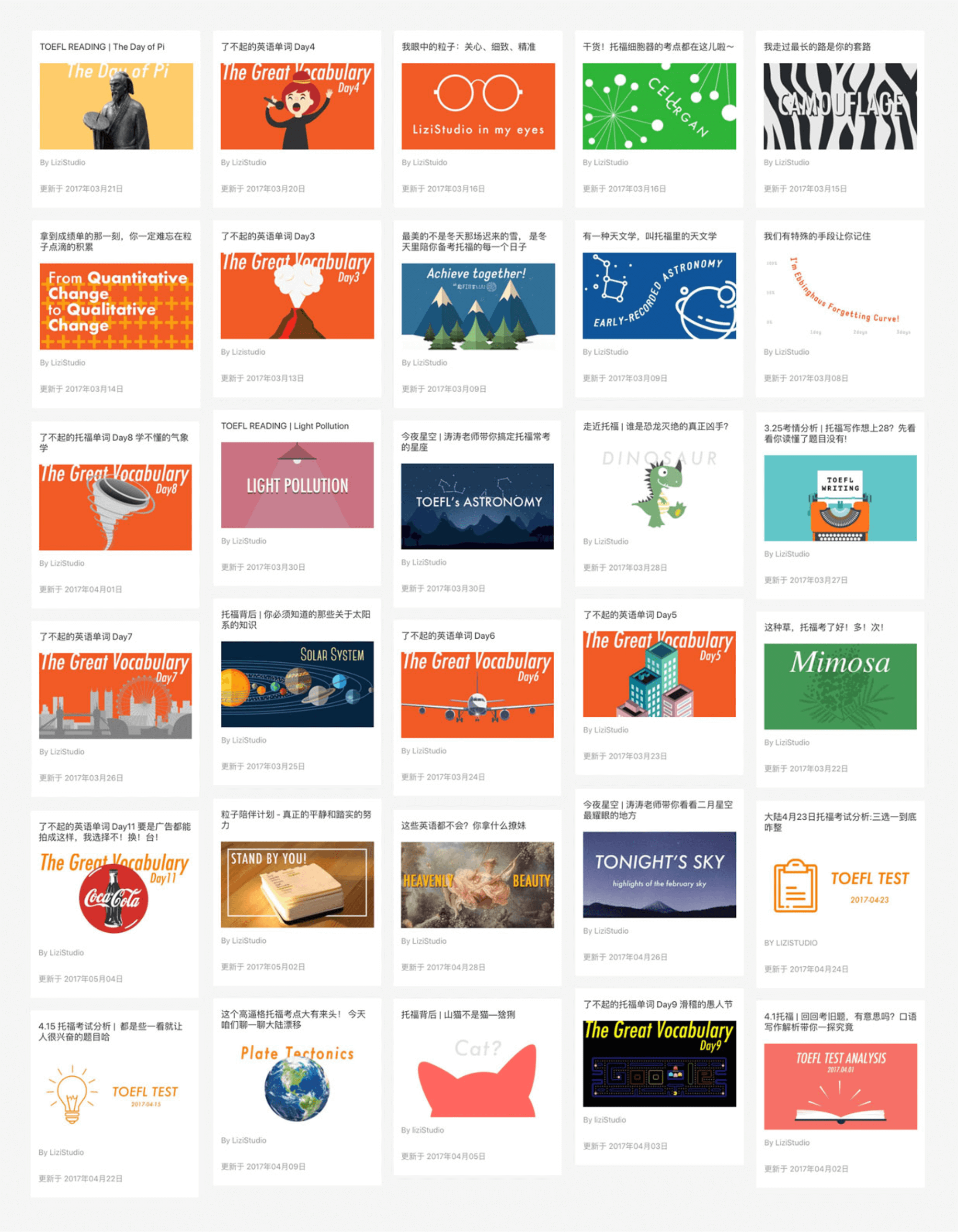
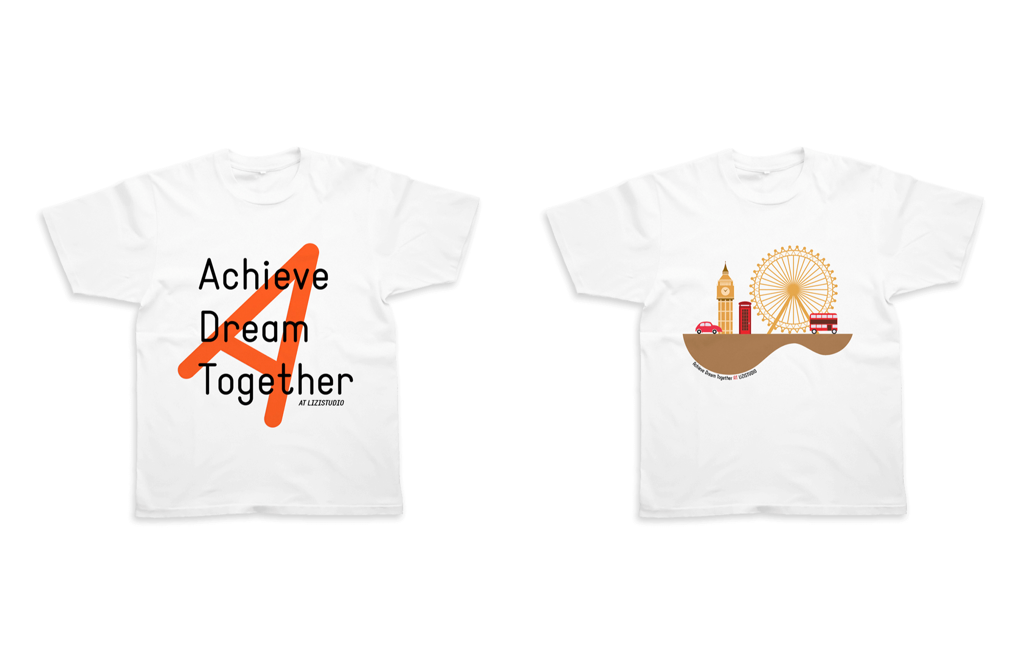
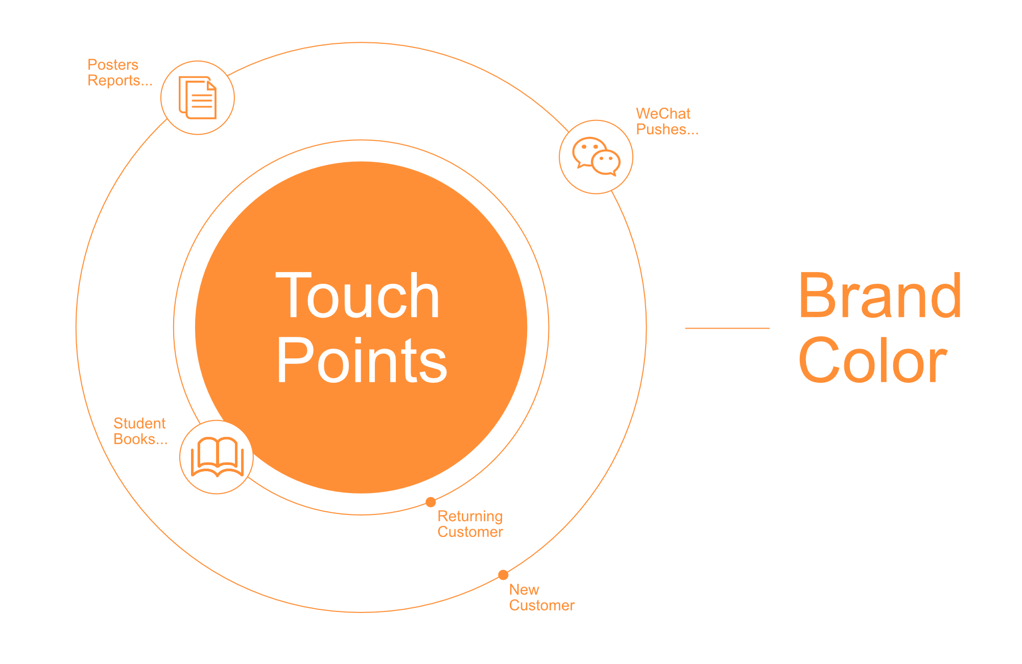
I built the visual identity system based on touch points and brand color. Lizi has three touch points. They are posters, social media pushes, and books. The first two are mainly for new customers. The imagination emphasis the brand style. Books are for firm customers (students) with a color system to easily choose and use and less brand style.
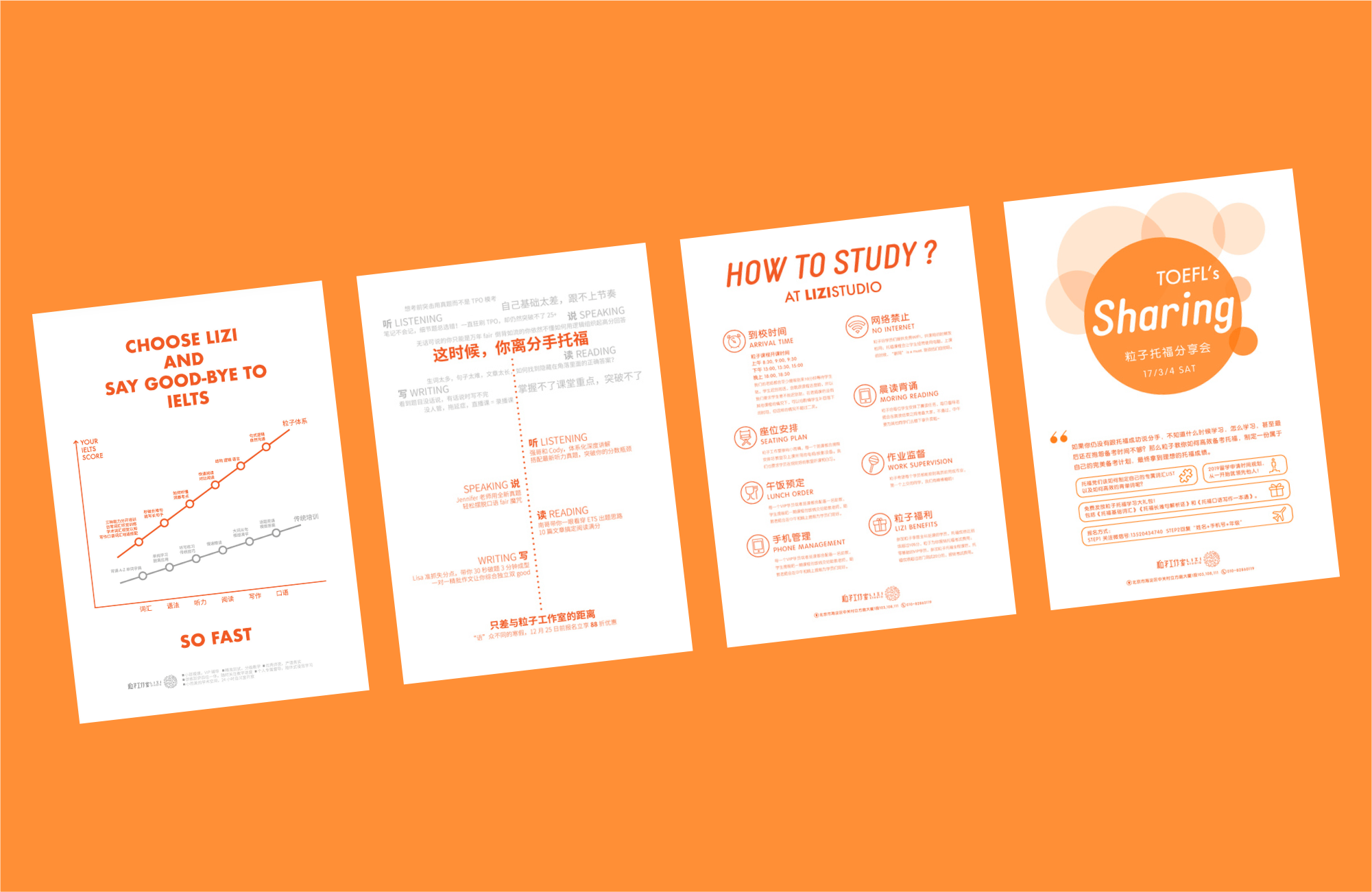
I organized the new logotype and the way to use, designed the visual concept for posters and reports. They are an international style, suit for English education with high quality.
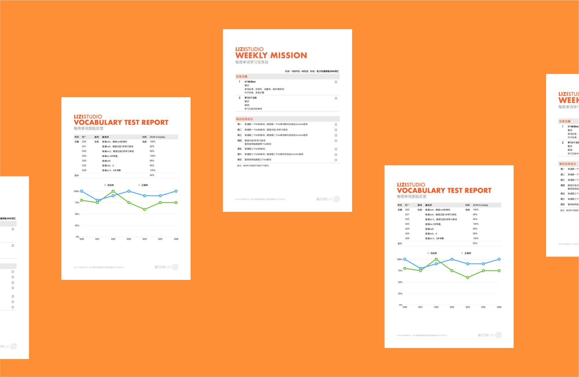
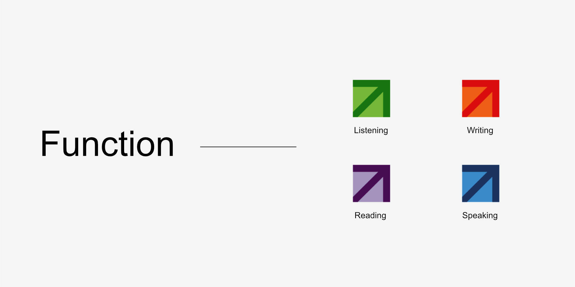
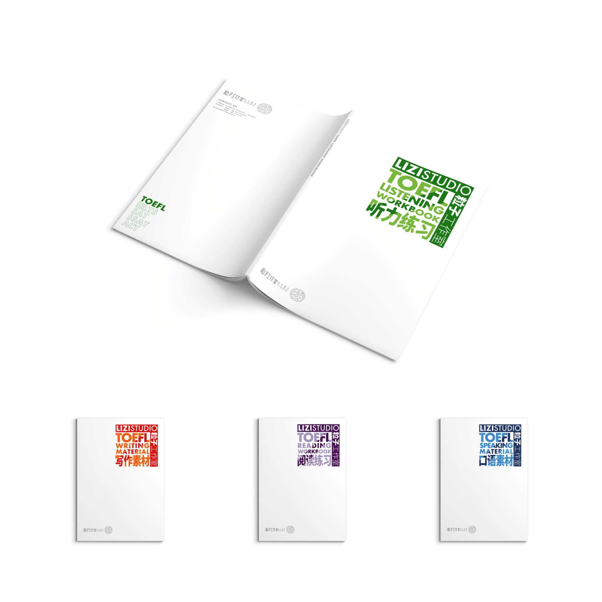
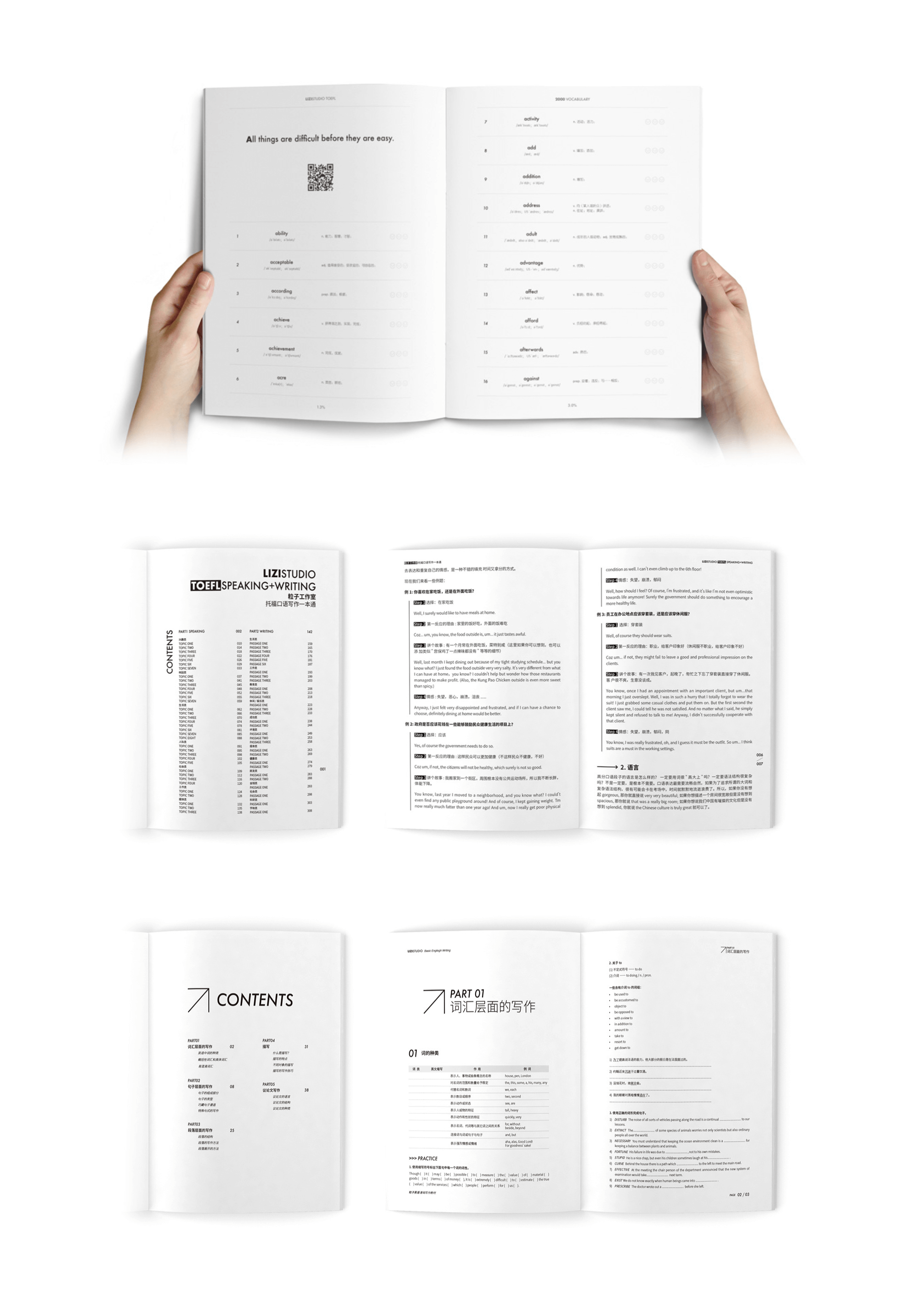
Books for students are function first. The up arrow means enhancing English ability. The color is designed to be easy to choose. The vocabulary book has the QR Code on every first letter page. It will open a page with pronunciation. The book pages are designed to fold, so that student can do the translation. Moreover, students can rate every word with emoji faces.
Wechat Push is a very important way to do commercial communication. I designed motion logotype and a series of graphics with a consistent visual style.