
Client / China University of Mining and Technology, Beijing
Time / Mid 2016 - Late 2017
MyRole / Design Director
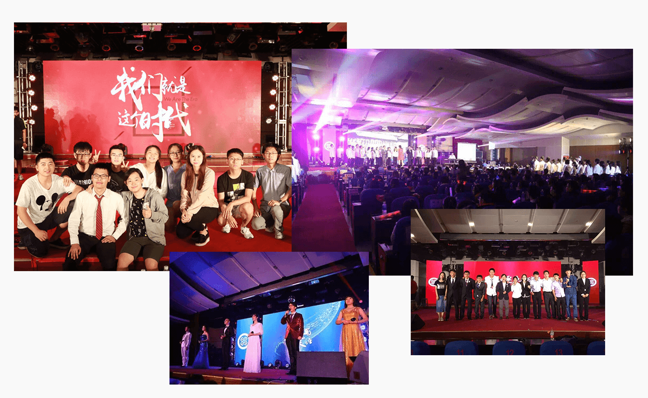
In the thired year of my university, with passion and love, I designed brand for my student union. During all kinds of activities, The brand has been a colorful part of every student’s life. In this part, I will show you two relative branding projects
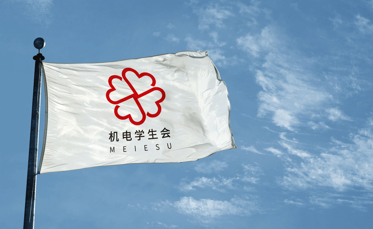
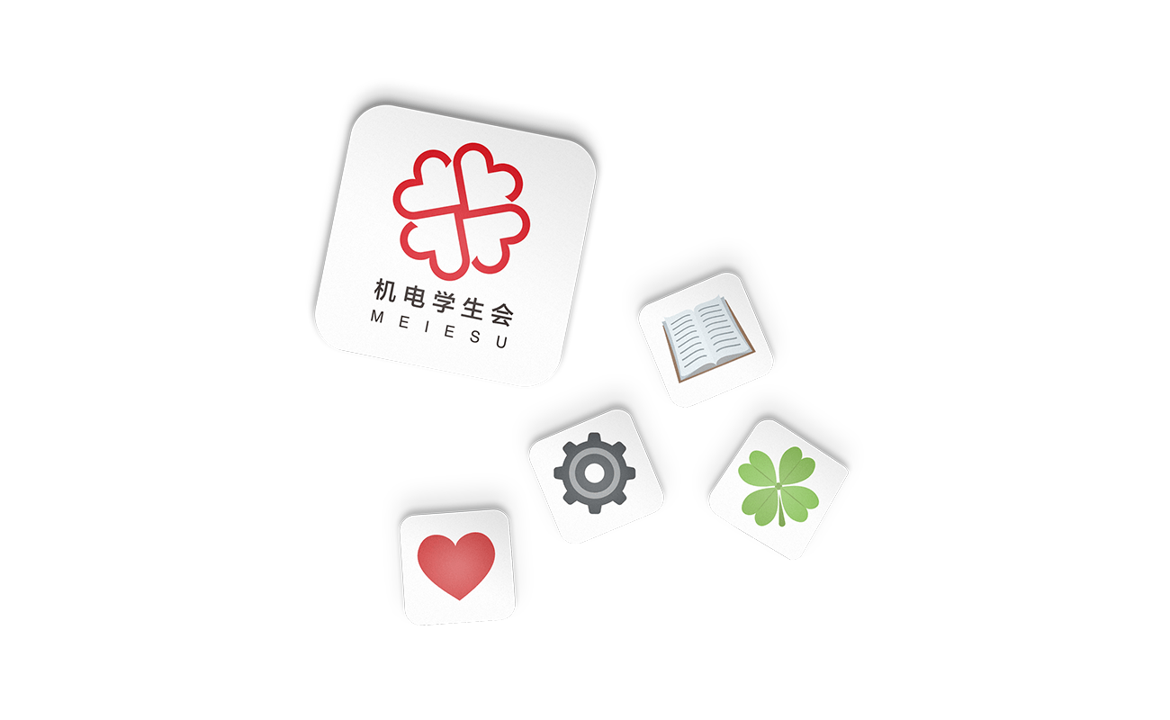
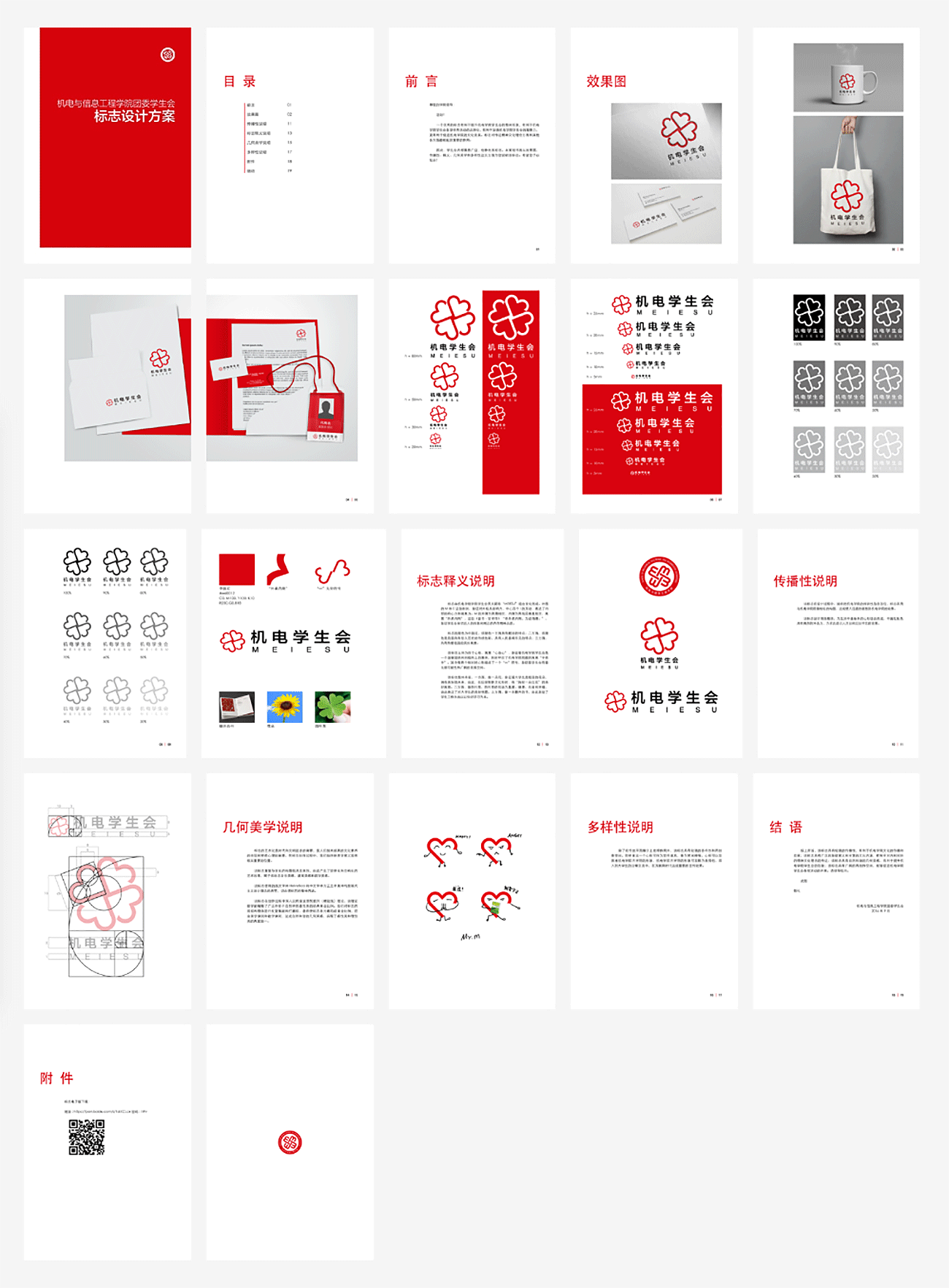
This Student Union is belonged to the School of Mechanical Electronic and Information Engineering in my University.MEIESU is full of cohesion as well as family love.
This Student Union is belonged to the School of Mechanical Electronic and Information Engineering in my University.MEIESU is full of cohesion as well as family love.
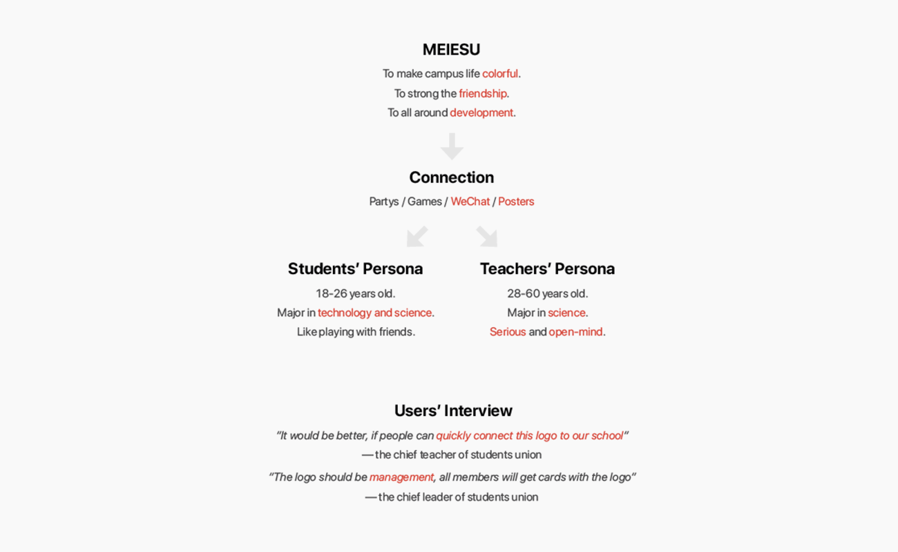
- Feelings of colorful, development, serious, science and open-mind.
- Quick mind connection to school.
- VI to enhance the imagination.
- WeChat Official Accounts Build to strong the connection.
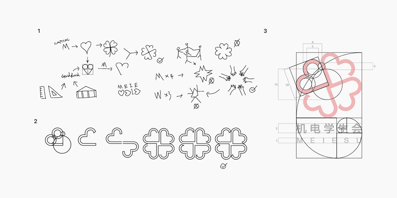
MEIE Students Union connect students and teachers by holding activities. I believe the branding design is to service those three parts. However, I did not decided the design direction by traditional mood board, I did the deduction by emoji! Because emoji is abstruct, which suits an abstruct logo with many meanings.
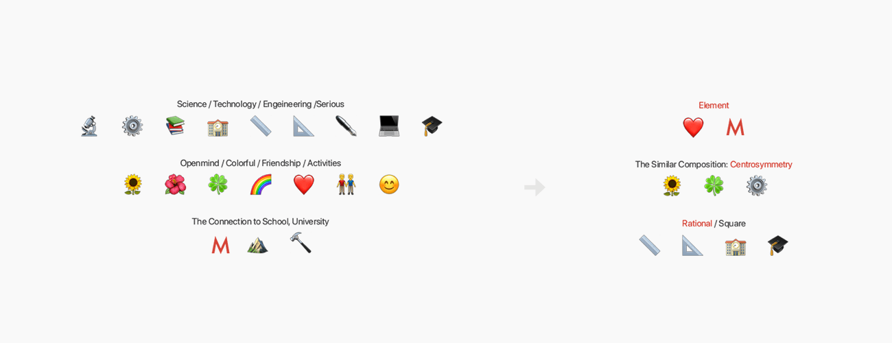
The design has many positive meanings, which strong the spritry of the student union.
Four Leaf Clover Flower: Love, health, glory and riches. which shows the best wish to students.
Gear: Most of the students are major in engineering.
Opening Book: Students have to emphasis the importance of learning forever.
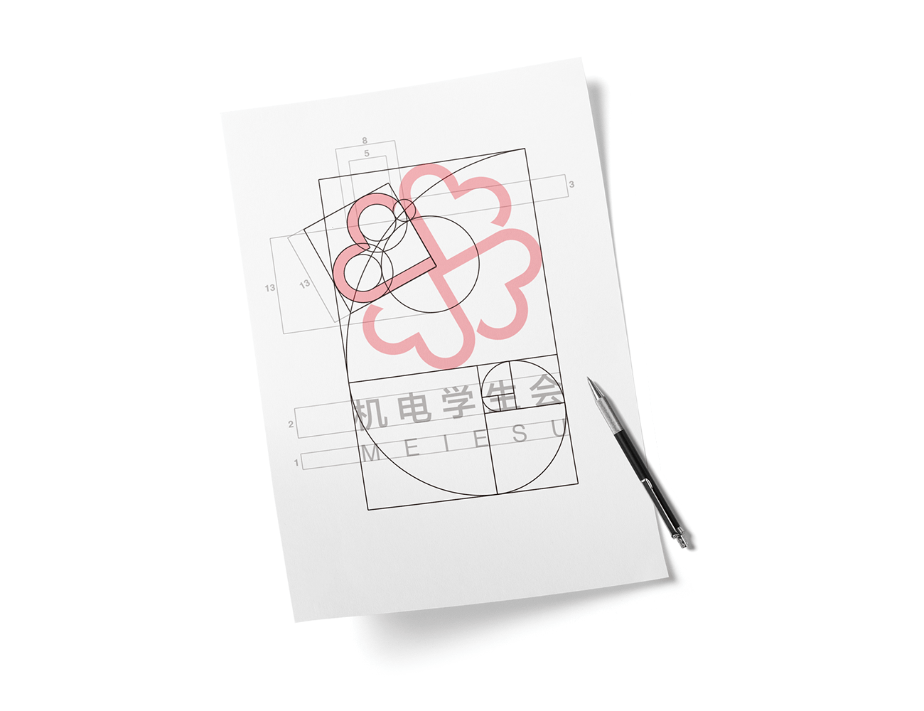
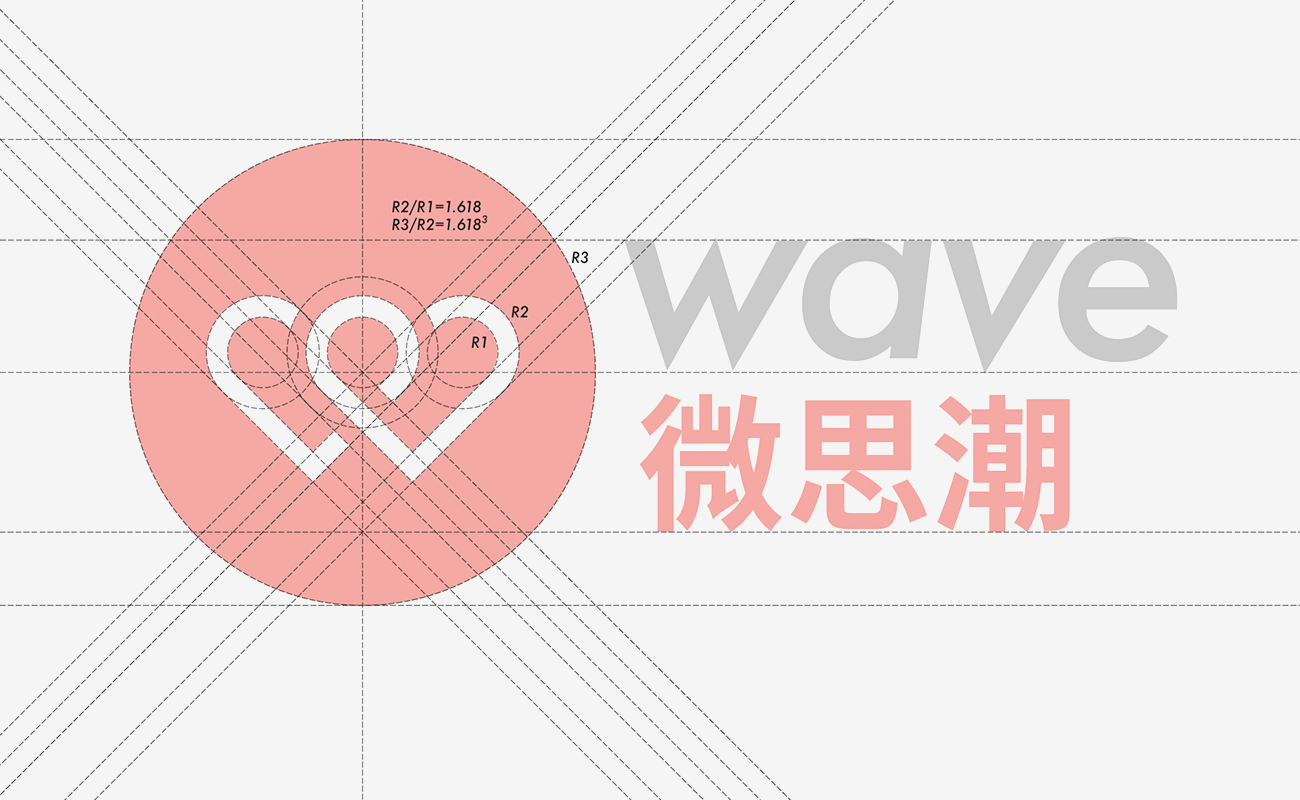
In the design, I fully apply the theory of Fibonacci curve, which describes the perfect golden ratio in the nature mathematically. I polished the every element for a long time, and finally make them in the rule of golden ration, which is full of rational beauty as well as perceptual beauty. It is welcomed and believed by everyone. Moreover, it has feelings of symphony and development.
I choose “Source Han Sans” as the typeface, the present of which is simple construction and some humanistic feeling, Which is of highly identity and some serious. Moreover the type is open source which is full of sharing spirit. The Typeface is deeply suit the logo and the spirit of MEIESU.
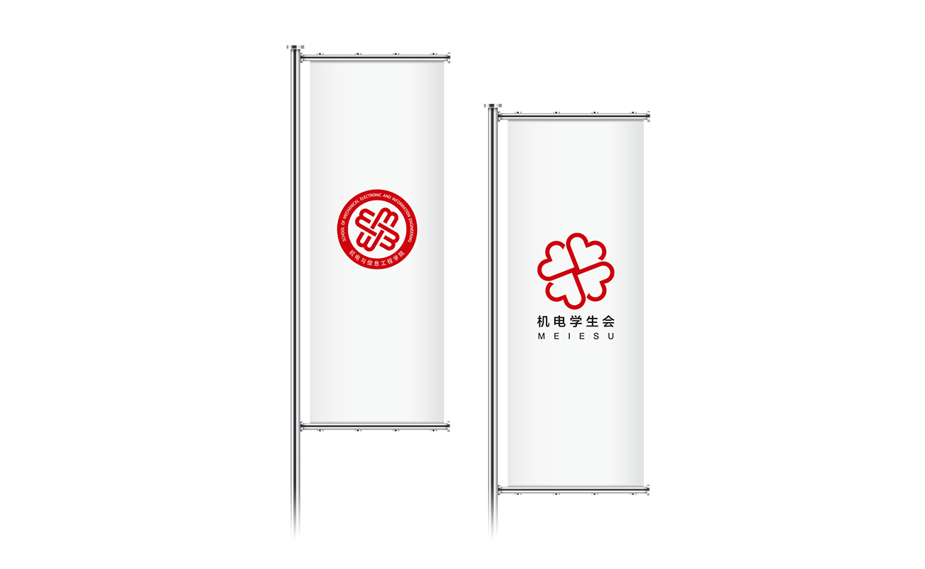
On the left is the logo of our school. On the right is the logo of the student union. These two signs need to have strong ties, so that the two signs can be associated with each other.
The meanings parallel with each other, the two logos have a same composition. People connect them easily.
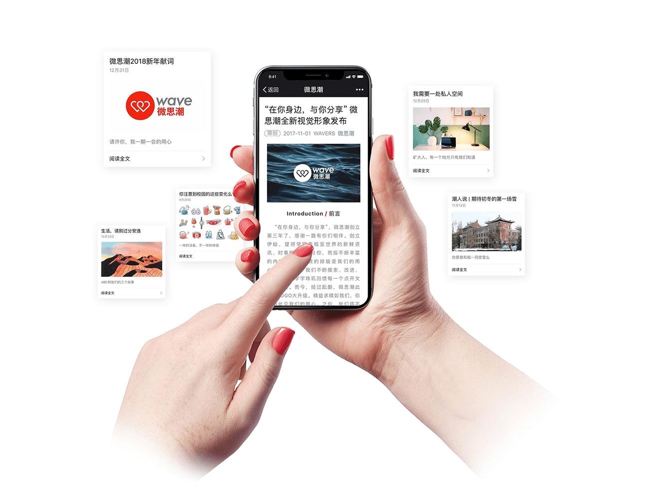
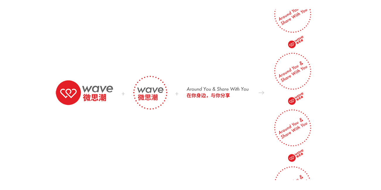
WAVE is an Internet media of school and student union. It pushs daily news for campus students. I designed the logo with the same strain of MEIESU.
Based on the elements, from M to W. Push News -> The red dot.
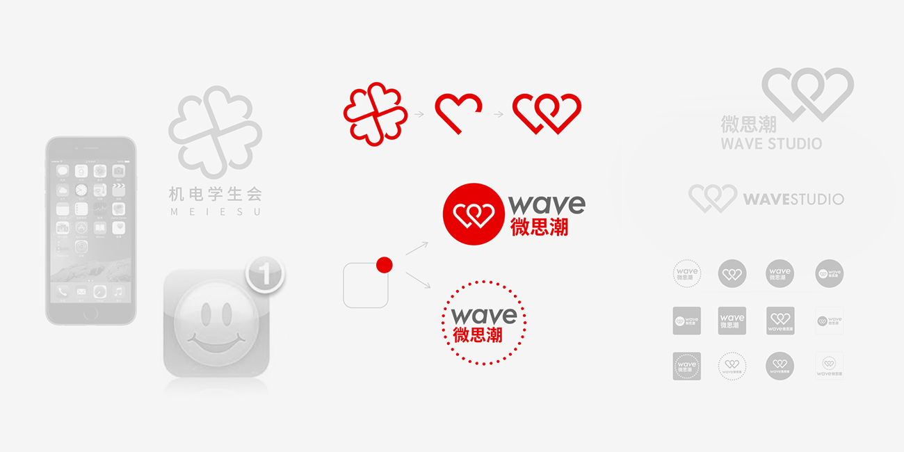
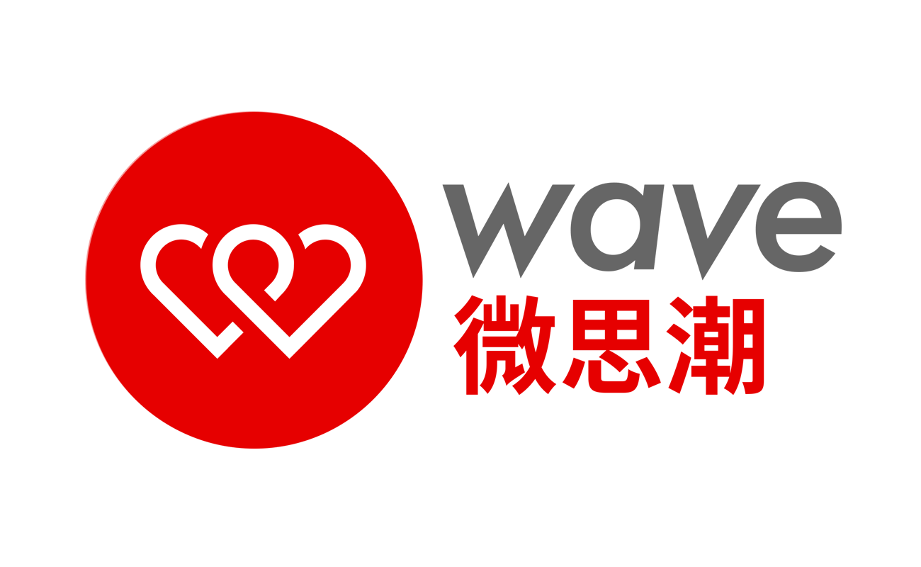
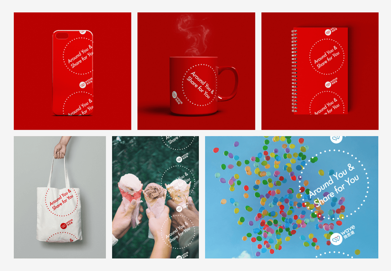
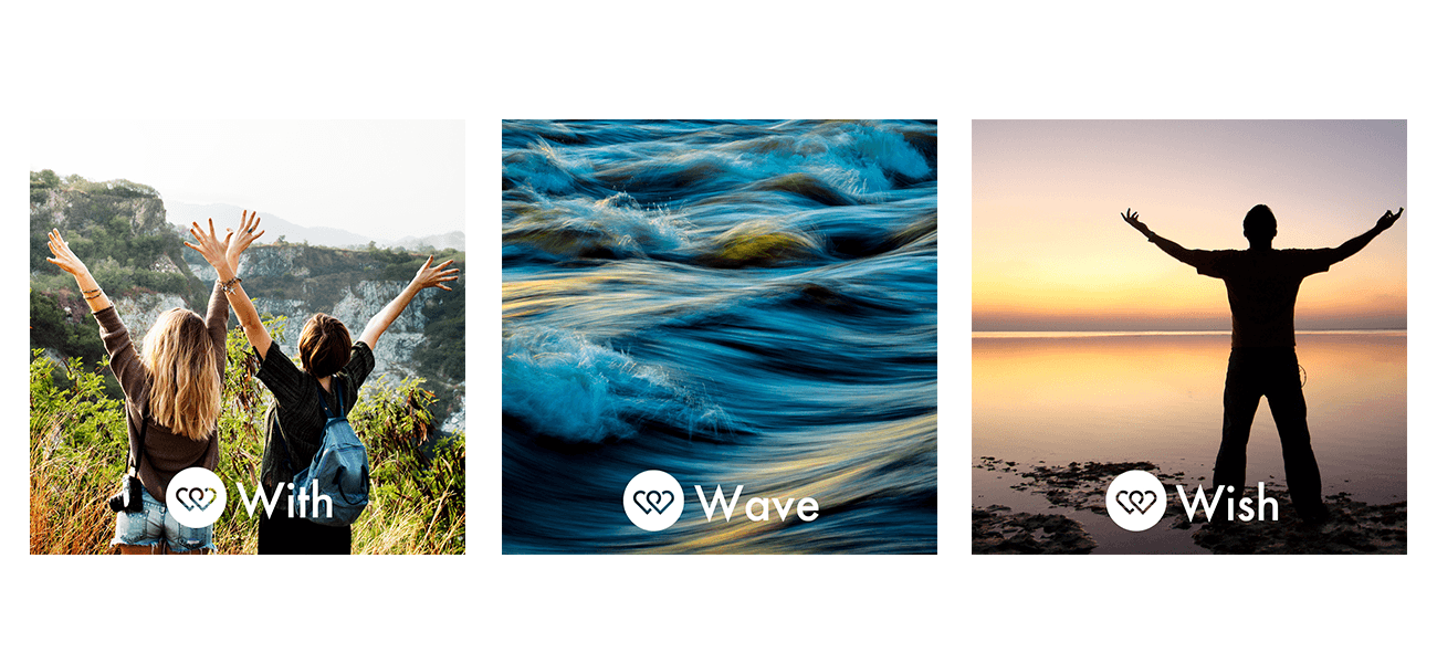
The origin is the beginning of all things. It is the most basic element that makes up the world. It is also our original heart. It implies endless possibilities of inspiration and infinite development of micro-inspiration. In the coming days, the micro-tide will not forget the beginning of the heart and move forward.

The points move into lines and the lines move into faces. The dots around the marks represent each push of micro-thoughts. Dots surround the heart-shaped body, cycle around, cycle indefinitely, and symbolize the inexhaustible driving force of micro-waves. In addition, the combination of the dots and the heart-shaped subject, the virtual reality, makes the picture rich and vivid, symbolizing the micro-tide, and symbolizing the youthful vitality of the electromechanical man.
We are always on the road. As early as the heart is still us, purely to accompany every beautiful moment in your university, we will be more careful, continue to explore the worthwhile material, the LOGO interpretation of the spirit into each push.

Every year, more than 100 people join MEIESU.
Wave Studio is valued at more than 4,000,000 RMB.
During all kinds of activities, The brand has been a colorful part of every student’s life.
GUESS YOU LIKE
